The Exploration Menu provides various options for customising graphs.
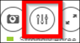
- Hover cursor in top right corner of graph to be customised. An ellipsis icon ... for "More" options should pop up
- Click the Exploration menu icon that appears
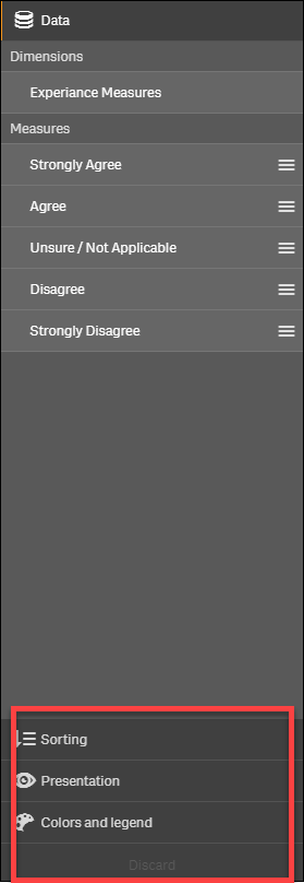
- Select customisation options from the bottom half of the menu on right side
- Sorting sorts by alphabetical order A-Z or Z-A or by increasing or decreasing data
- Presentation changes vertical to horizontal bar charts, donut or pie charts and toggles the value labels
- Colors and Legend provides alternative colours for the graph
- Discard reverts the graph to default options
- Close the Exploration menu with the cross icon

|
|
